A case study
Filament Insights
The story
Filament started with Flare, a social sharing tool for blogs. From there it evolved into full analytics platform for content creators. It tracked several new proprietary engagement data points and helped users better identify their best content to grow their audience faster.
Our small but mighty team
Our product team of three included a full-stack developer, product owner and myself on design hustling to launch a premium SaaS application and find product market fit.
Timeline: Mid 2013 to early 2016
My Contribution
I designed the entire experience end-to-end. This included:
- Dozens of marketing site iterations and web development
- User Research
- Running testing experiments on our activation funnel
- Designing intuitive data heavy analytic interfaces
- Refining onboarding and increasing user adoption
And trying to add a bit of delight to the whole experience along the way. 👍
The Outcome
Spoiler alert: Filament debuted as an incredibly lean daily email report and evolved into a powerful, yet intuitive content analytics platform that was acquired by ShareThis in 2016.
Along this wild and gritty ride there were no fewer than five major course corrections, full redesigns and business model pivots. Read on to learn a little bit more about how that whole process went.
Research
Uncovering the real need
Our Flare share bar users told us often that they wanted a simple leaderboard for their top shared posts. We knew that vanity metrics weren’t all that helpful in the long run, so we dug into what metrics were really insightful for them, by talking to nearly a hundred users and clients.
I conducted user research and user tests at all stages of this project. We used Intercom and usertesting.com often to maintain a steady flow of new and continuing user dialogs.
Early MVPs for lean testing and learning
We wanted to practice what we preached with our design clients, so we kept it as lean as possible and we made sure to learn something new with every tweak.
We invited some of our paid Flare users to participate and also used landing pages like this to drum up interest in the new tool.
Implementation – Going lean
Version One
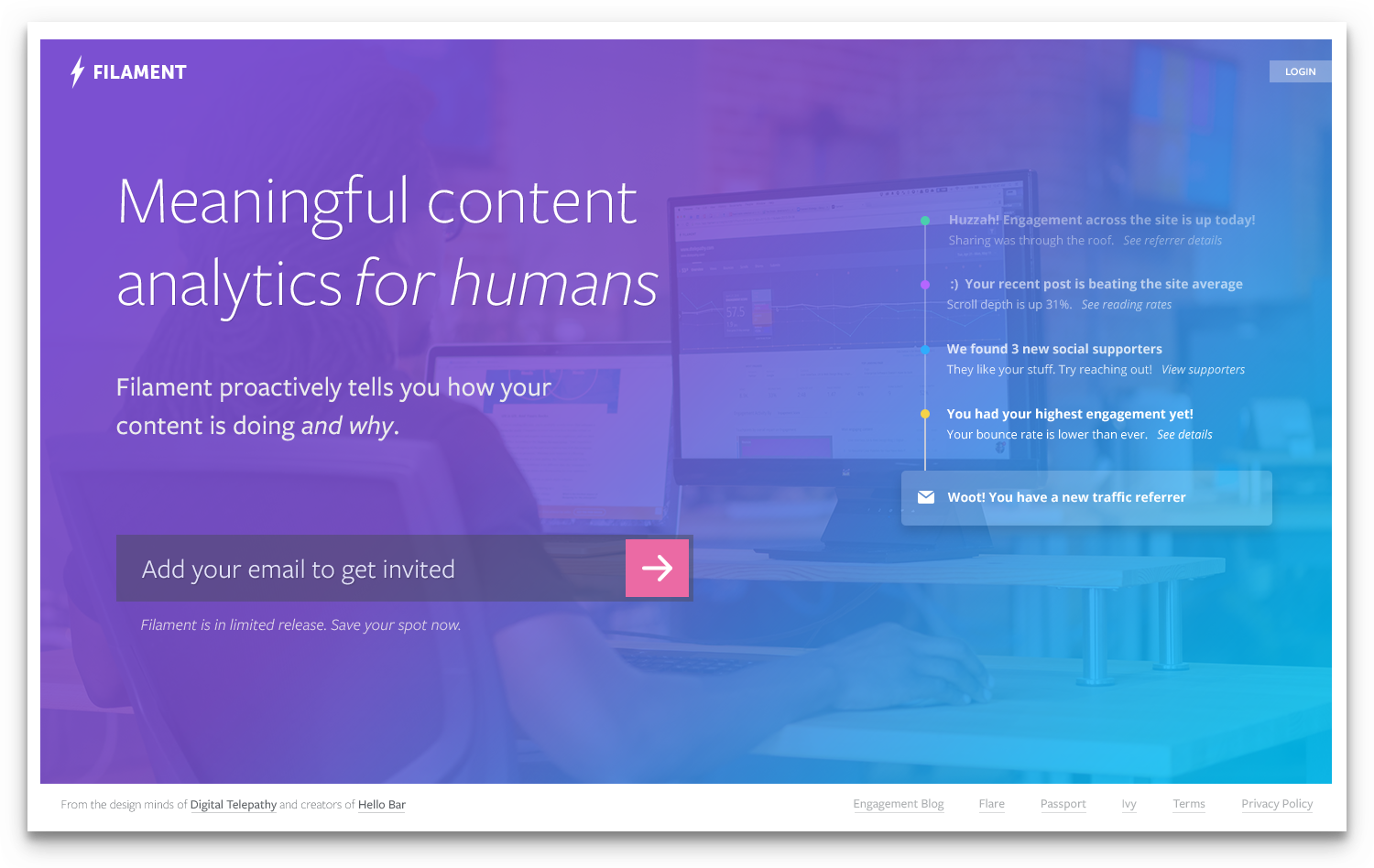
The Daily Email Alpha
We bolted on a quick flow for our Flare users who opted into the Alpha to connect their Google Analytics account. This, coupled with our code snippet on their site to insert Flare was all we needed to start experimenting with real data.
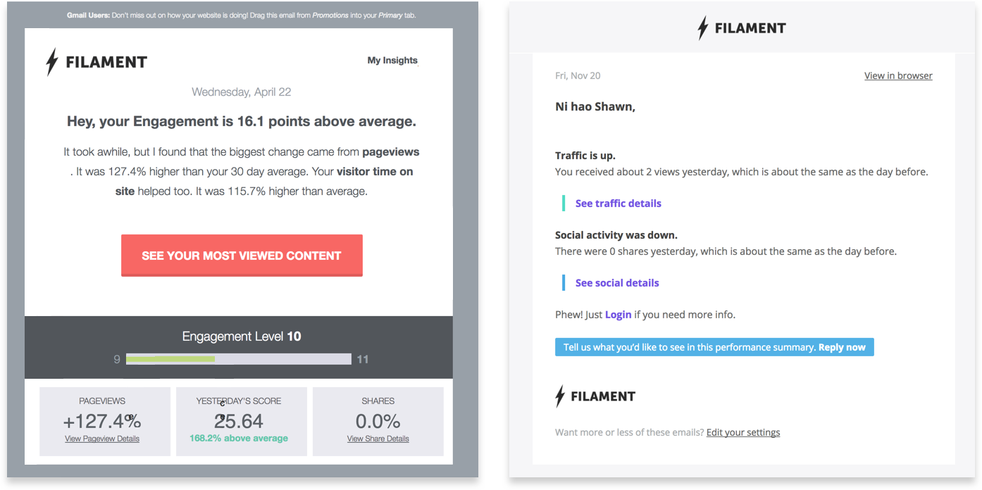
In the earliest versions, it utilized basic Google Analytics information coupled with sharing details to find highly engaging content on your site. This simple interface was well received since it was effortless on the user’s end. However, they still wanted to understand why that content was outperforming.
Version Two
Time for a proper dashboard!
After continuing conversations with users and lots of coffee consumed in front of a whiteboard, we focused on creating an intelligent analytics page that told you “the why” behind the numbers.
Concepting "the why"
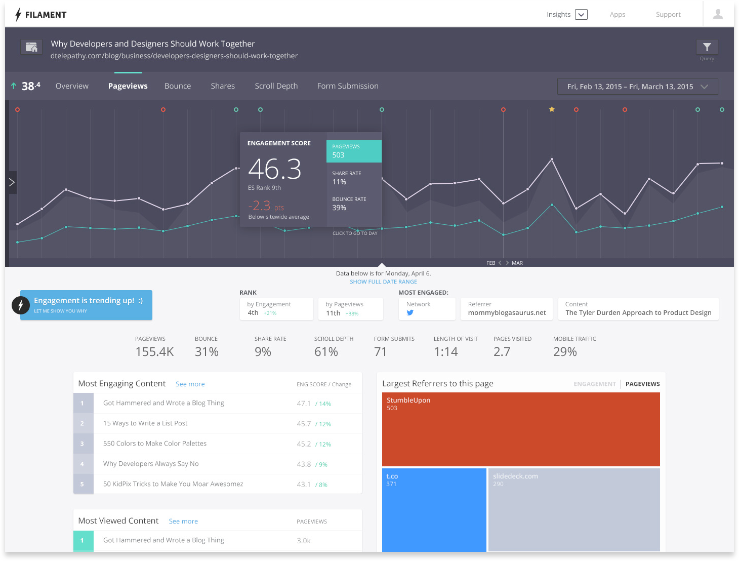
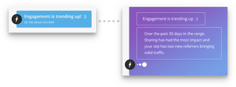
I designed a concept that focused on the idea of a single “Engagement Score” for your site, then highlighted the content that was outperforming the median using lots of really complicated math. We bit off a bit more than we could chew in this mathematical endeavor.
We wanted to expand the voice and personality of Filament, so we used a chatbot like interaction to unpack illustrate why their site was more or less engaging.
Humanizing analytics
We really weren’t unearthing shockingly new information here, but we packaged it up nicely in a bite-sized way that our users enjoyed.
Overreaching
We blended together scroll depth and pace, along with sharing information, traditional analytics and more to build this score. They were too fixated on boosting this logarithmic score, rather than growing their reach. They were missing the forest through the trees. It took us nearly a year to finish trying many variations and systems for Engagement Score before significantly deprioritizing it.
Version Three
Time to simplify a lot.
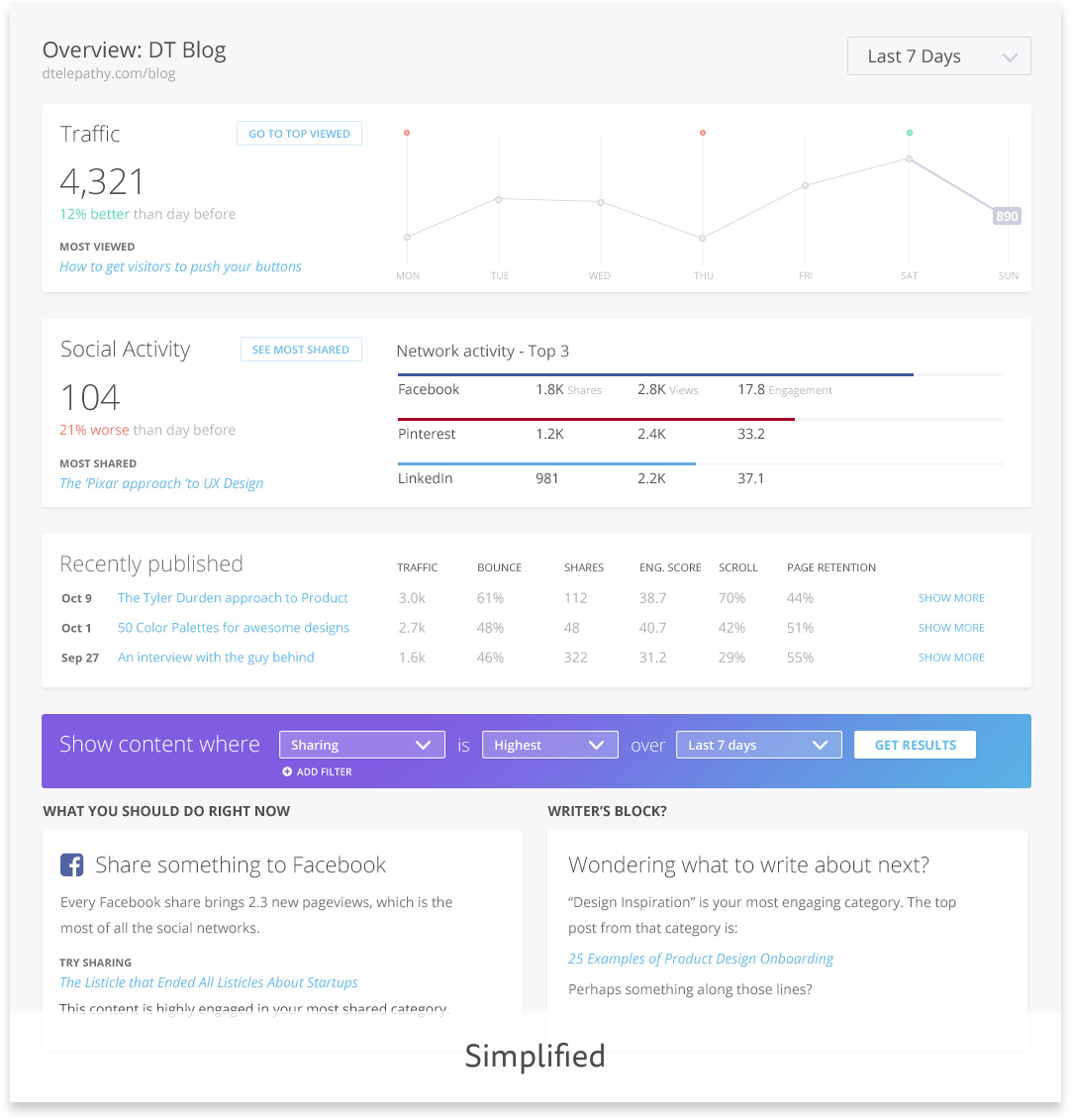
Then simplify again. Repeat.
We simplified the dashboard tremendously
Gone were individual engagement data points for sharing, traffic and others compared against your site average. Users were excited to have a unified dashboard. Detailed sharing and engagement information alongside traditional analytics wasn’t available together anywhere else.
We worked with several awesome users who were really hoping to see Filament become their analytics workhorse. Together with them, we refined the flow of using Filament until it was as quick and effective as possible.
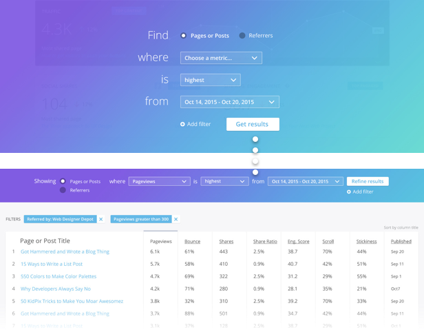
Users got easy answers to hard questions
Such as:
- “Which social network is most engaged with my content this week?”
- “Which blog category was most thoroughly read this month” were available in seconds.
We made it very easy to see your “best” content, by whichever dimension was most important to you. If you were a long-form content creator, Read Rate resonated. If you were a trendy Mommy Blogger, sharing was king.
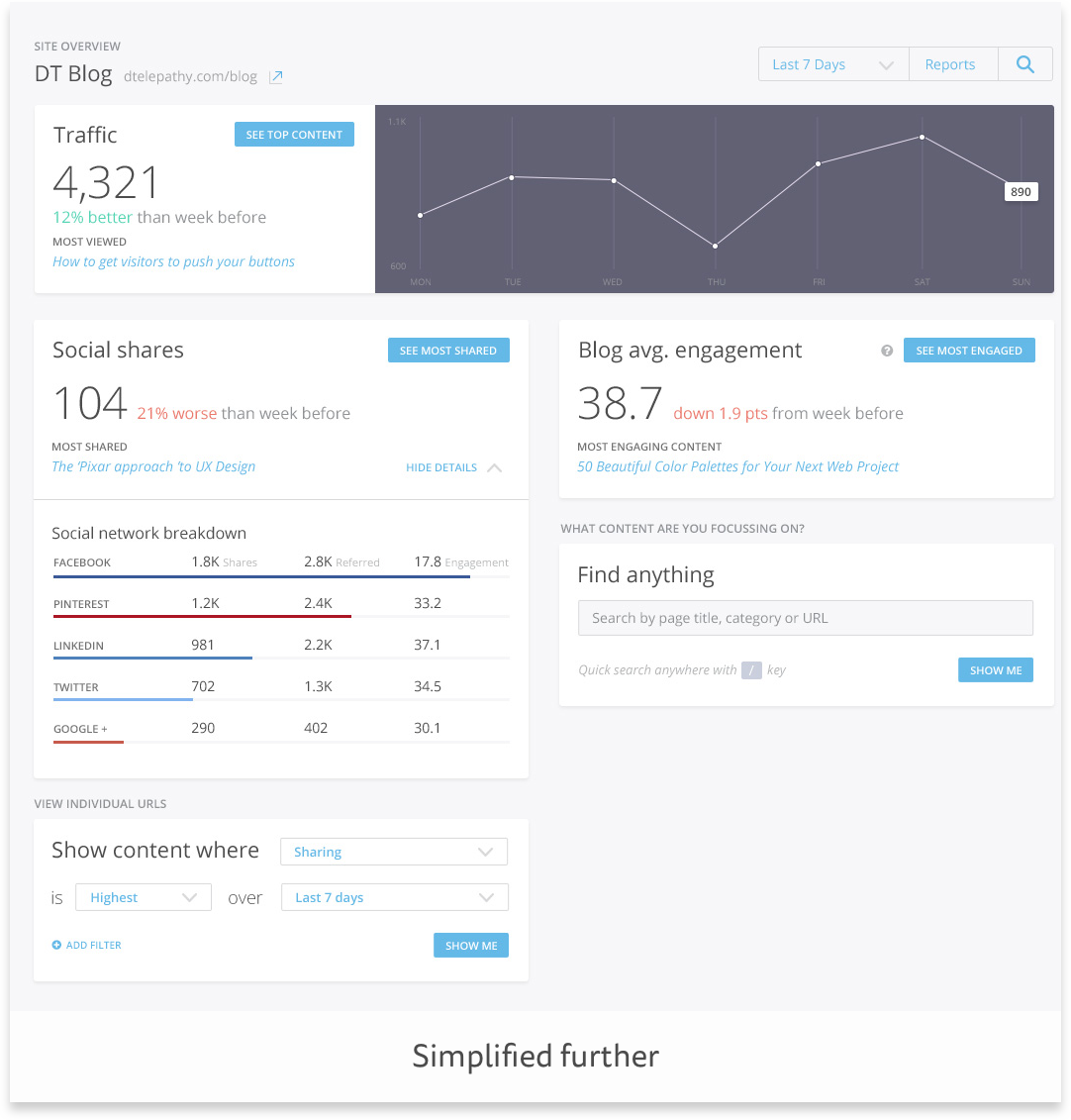
Version Four
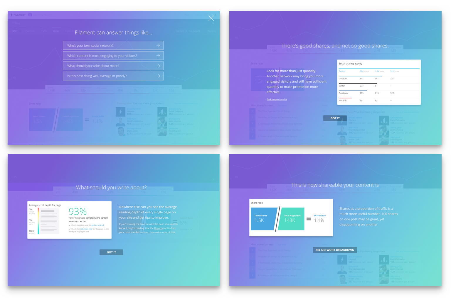
A card for everyone & Simple reporting
This was our most successful design yet with users
They really enjoyed the simplicity. There was a lot of data on the page, but it wasn’t overwhelming and it came with context. As you can see, our beloved Engagement Score had resigned to being a footnote at the bottom. We added a “Tips” feature that gave very clear recommendations like “Linkedin is your most engaged network, you should share more there.” or “Your Politics category gets the most shares and traffic, you should write more posts on this topic.”
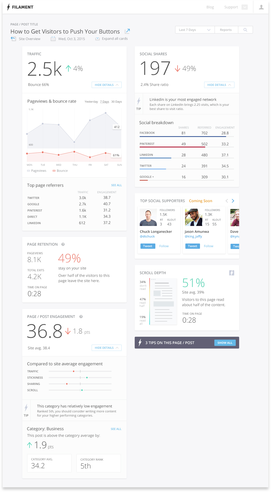
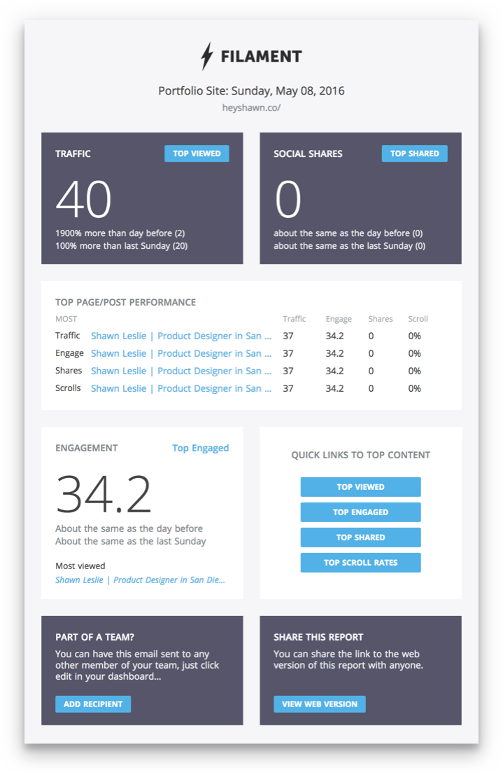
The easiest reporting ever
Analytics is anything but simple. Reporting is incredibly clinical and not very fun, so we at least tried to make it easy. Again our muse was imagining that you had an assistant fetching data for you at your every whim.
Revisiting our daily email
Learn mode for the users
Throughout the Filament’s many life cycles, we focussed heavily on activation, which you can read more about here, where we over tripled our signup to activation rates.
Once users connected Filament, it took a few days for us to start compiling interesting data and insights. We called it the “Dark side of the moon.” So we used that time to get them excited about what to expect with educational coach marks that tackled most new users FAQs.
The Bottom Line
Learn mode for our team
Filament was a very wild and gritty ride! Through all the twists and turns we nearly shut it down twice!
Dave, our full-stacker architected an entire product, while diving deep into data viz frameworks and machine learning – in 2013! Jason, our Product Owner leveled up to mathematical levels that Russell Crowe’s character from “A Beautiful Mind” would be stoked on. I learned how to tweak, refine, test, tune and increase every inch of a product’s design and experience from tip to tail. Phew!