

Time to glow
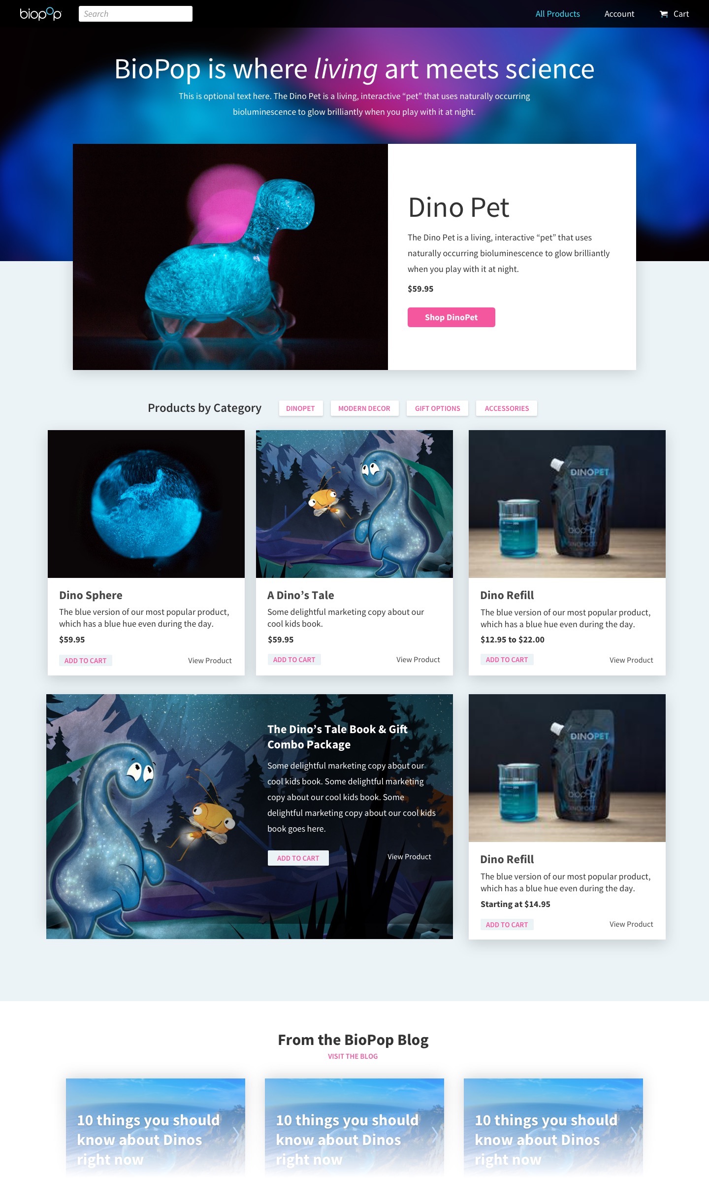
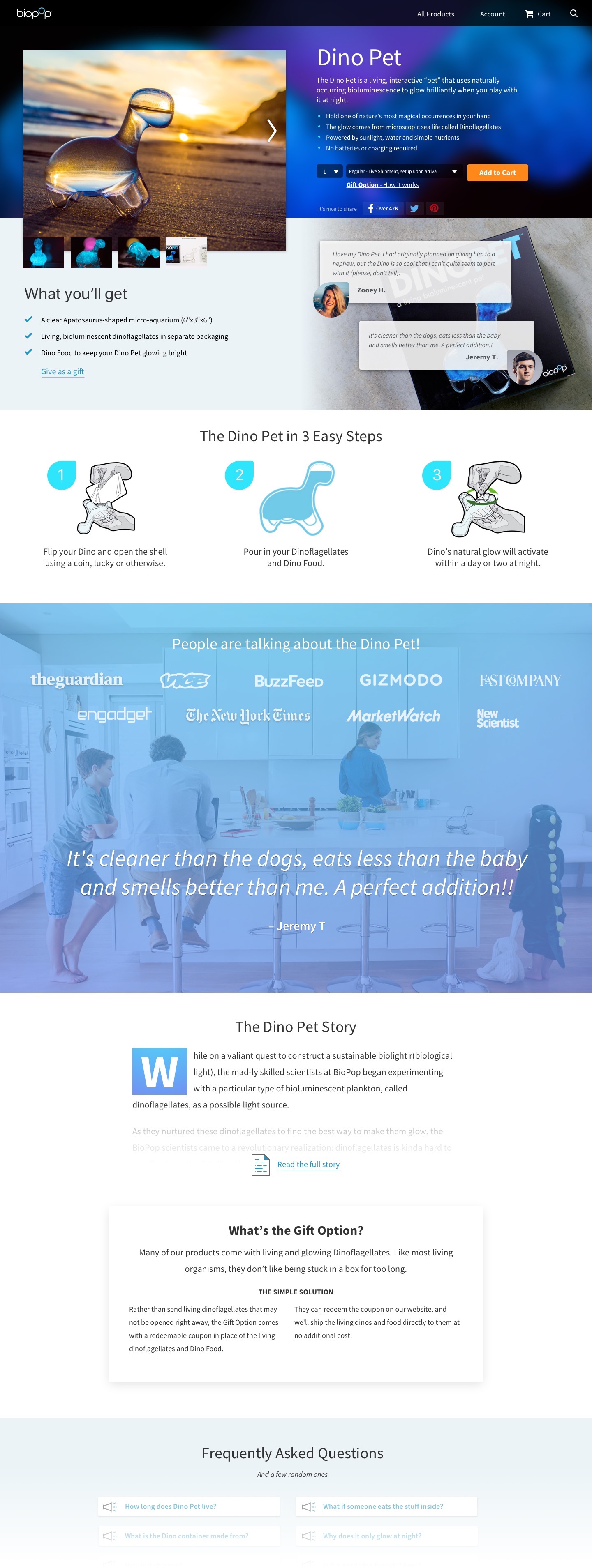
The Dino Pet aquarium uses naturally bioluminescent dinoflagellates to glow at night. Traffic has exploded since it gained internet fame in 2015, thus the site needed improvements to perform.
I subscribe to user-centered design, so this is what my flavor of it looks like.
Every project of any size has at least one goal; be it for the business, the user, or both. So I start by getting a firm handle the primary objectives. Rarely have I been handed comprehensive research or user data, so I usually employ tools like Intercom to talk to five or so target users. I’ll write a handful of user stories and start creating flows.
Usually around this time, ideas start flowing, so Post-it® notes drawn with the very same Crayola washable markers my four and six year old daughters use start piling up. One of my strengths is rough idea generation–so I rapid fire out as many as I can. Airdrop and Trello, FTW!
Armed with fistfulls of Post-it® notes, I’ll begin drawing and sticking things to whiteboards while revisiting what we know so far. I learned a killer whiteboarding framework from my pal Brian that’s saved me no less than a few hundred comps. I’m no stranger to experience mapping at this point, but I usually go there after we have a prototype or an alpha to shop around.
If this is a new feature or entirely new property, I’ll start roughing out key components of the interface in medium fidelity. This step is skipped when we already have a battle-hardened style guide. Formerly I built high-fidelity prototypes in Axure RP. Now I lean on tools like Invision, the aforementioned whiteboard framework and straight-up HTML and CSS. I’ve experimented with Framer and Principle in the past and I’m keen to use them more when the project calls for it.
Now let’s get some buy-in! As always, depending on the scope, I’ll circle back with my stakeholders and Product and Engineering teams to socialize my designs and explain the choices that got us here. I'll double-check myself on both constraints as well as satisfying our objectives.
When everything feels pretty sound, I’ll move into rounds of visual design. One of the more challenging aspects is making things feel new, while still staying familiar and on brand. I’m a little crazy for the 8 pixel grid and type ratios, so this helps a lot, IMO.
The dev side of me loves to get to know the project through the lens of the engineering team. I secretly wish I were talking to API endpoints and writing micro-services, so I usually get to know them pretty well. I learn quickly what each team likes or needs to from me for a successful implementation. Some need redline docs and assets exported, while others just need a Sketch file and 20 minute walk-through. So wherever we land within that spectrum for that project will dictate what happens next.
I try to call out elements and events in my designs that I know we’ll want to observe and track (remember those objectives?). I’ve seen a lot of projects go to production with little to no tracking, leaving us hard-pressed to guess what is making it perform better; or worse yet, why it’s underperforming. I geek out on the engagement metrics and love to work with product to analyze these and ideate - here come the Post-It® notes again!.
I work in the real world, for a small hustling startup. Sadly, far too often there isn’t time for several rounds of iteration, and we only get one more pass at refinement. But when it does happen, and we have data to iterate and experiment on, it’s been the most fulfilling project cycles of my career. Then we can rinse-and-repeat until those objectives evolve into new ones, but the process is never done.
